In 2015 we developed this RFP-winning proposal in a national design competition for new Baltimore City welcome signage.
This unbuilt project goes beyond signage to conceive a flexible graphic identity system that includes wayfinding, sculptural forms, and beyond.
A memorable symbol
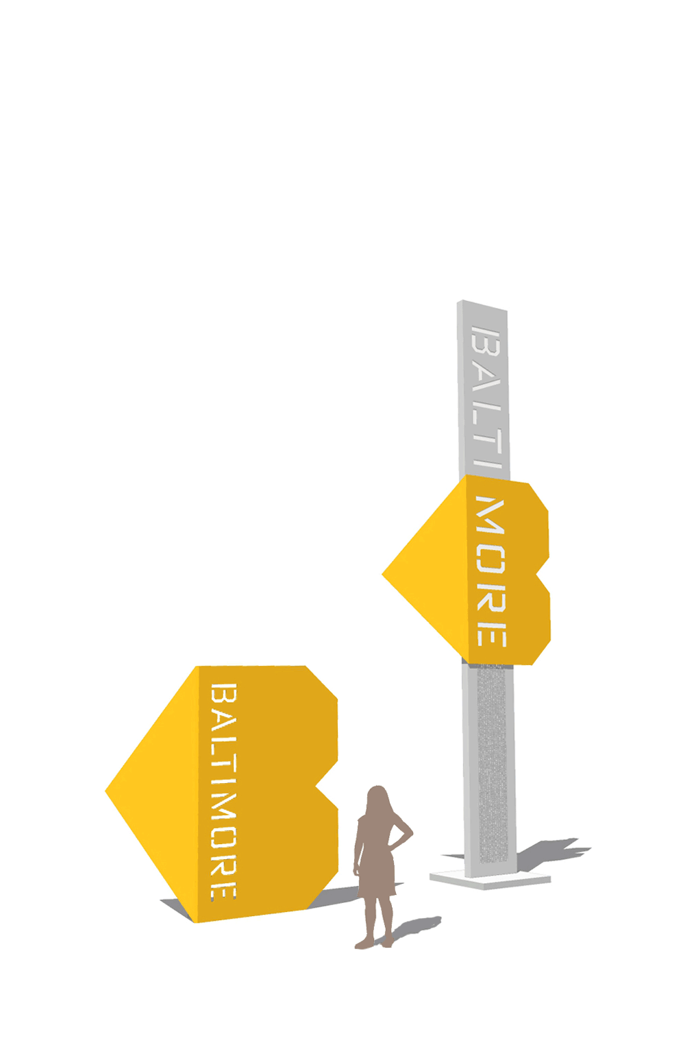
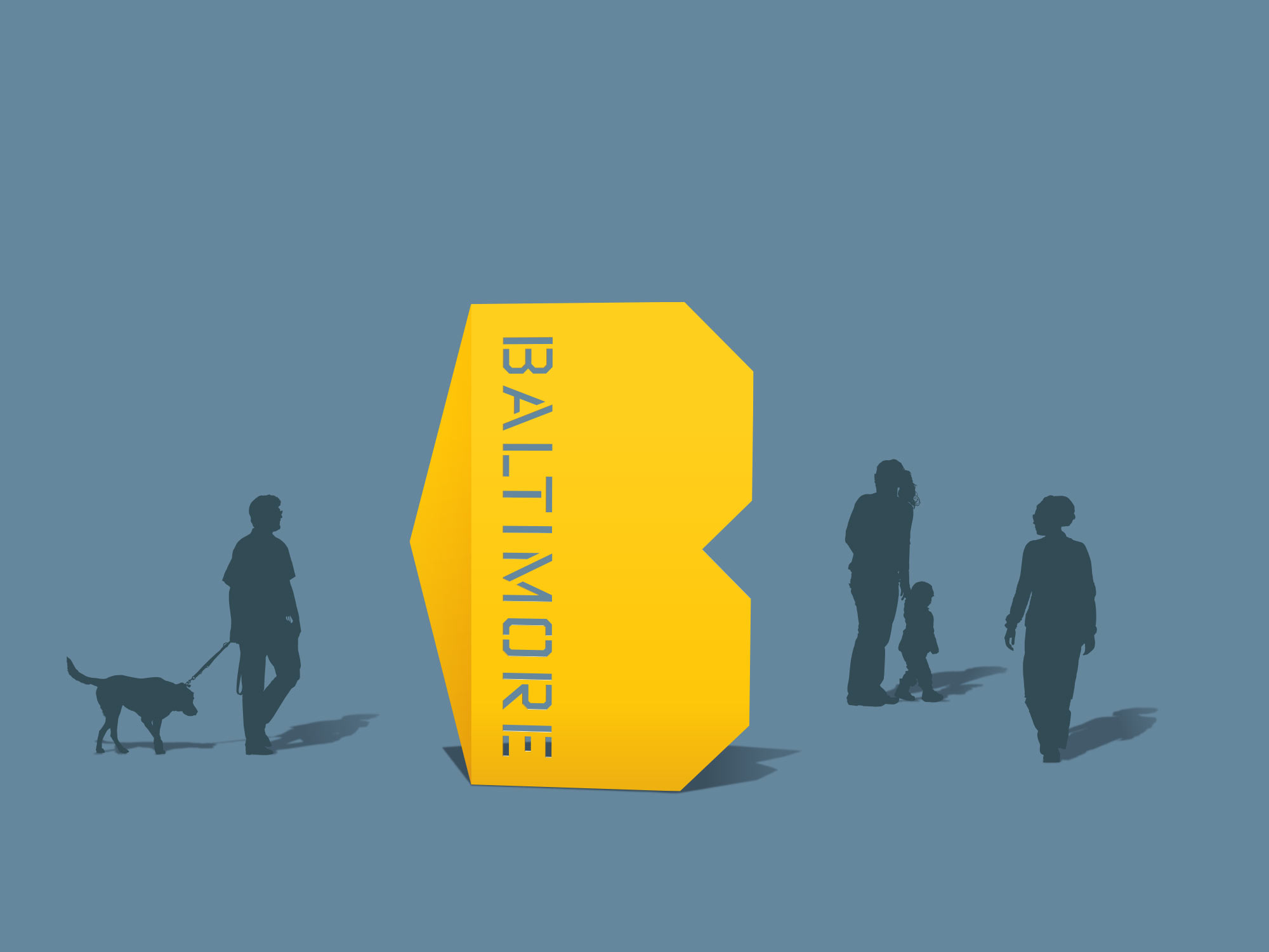
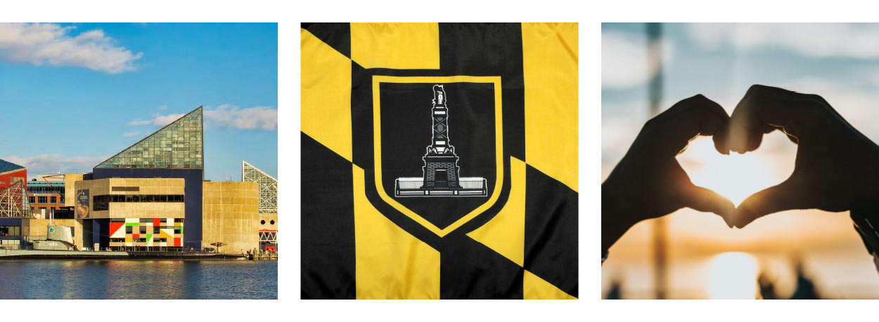
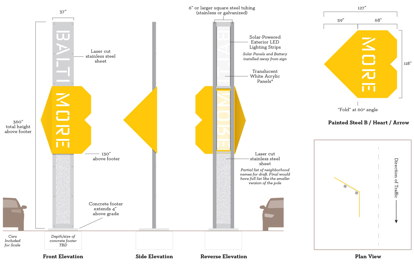
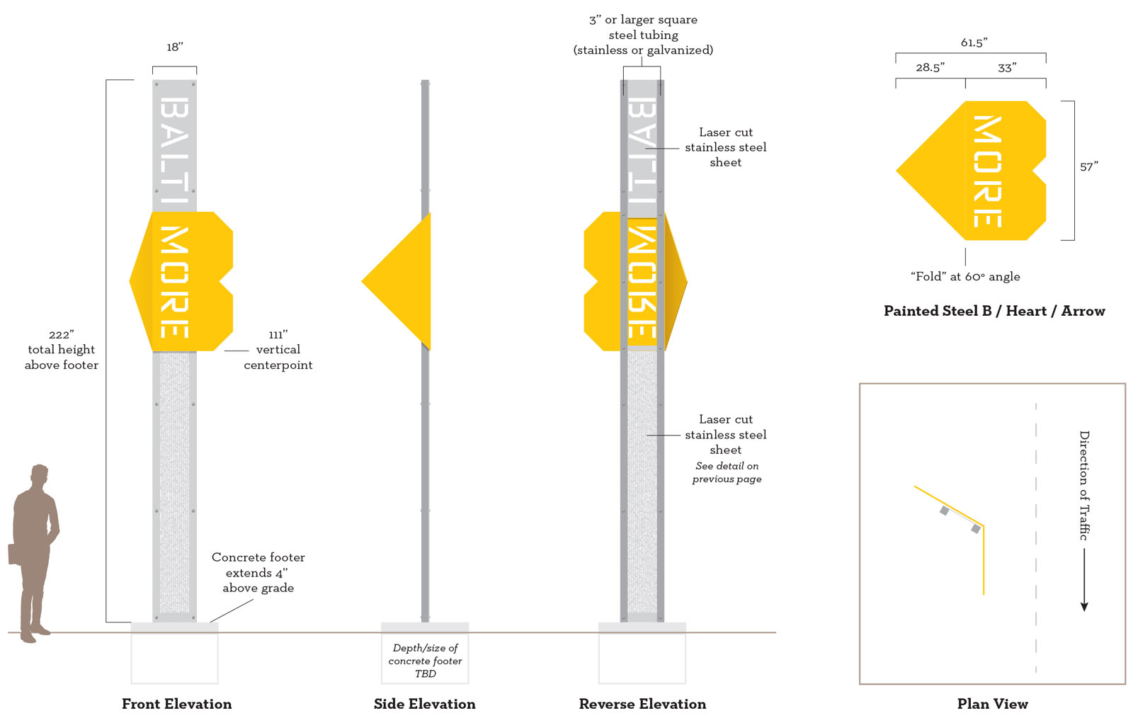
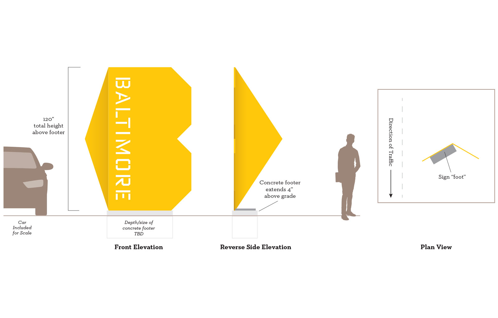
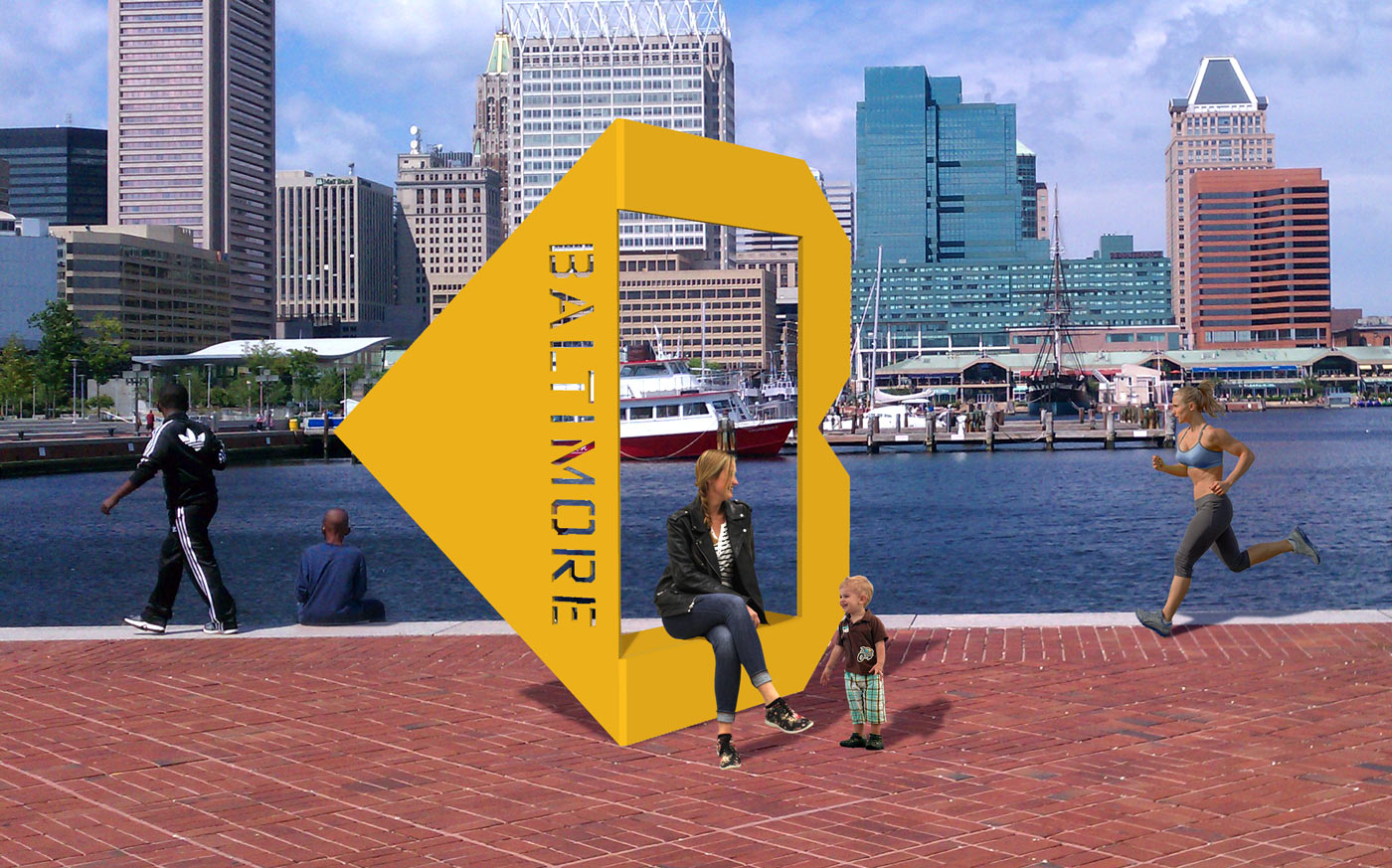
Our concept draws inspiration from Baltimore’s city seal, its fierce neighborhood pride, and its friendly, unpretentious spirit. We joined the letter B with a forward-pointing triangle to form a shape that suggests a heart, a placemarker, and an arrow. The angular lines and warm color come from the Baltimore city flag and the geographic shape of the city.
The emphasis on the letter B is a reference to “Bmore,” the city’s affectionate local nickname.

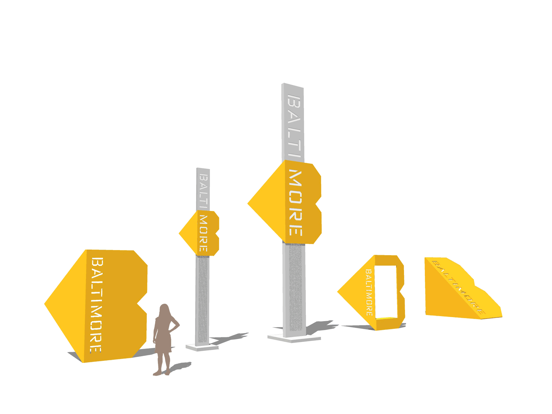
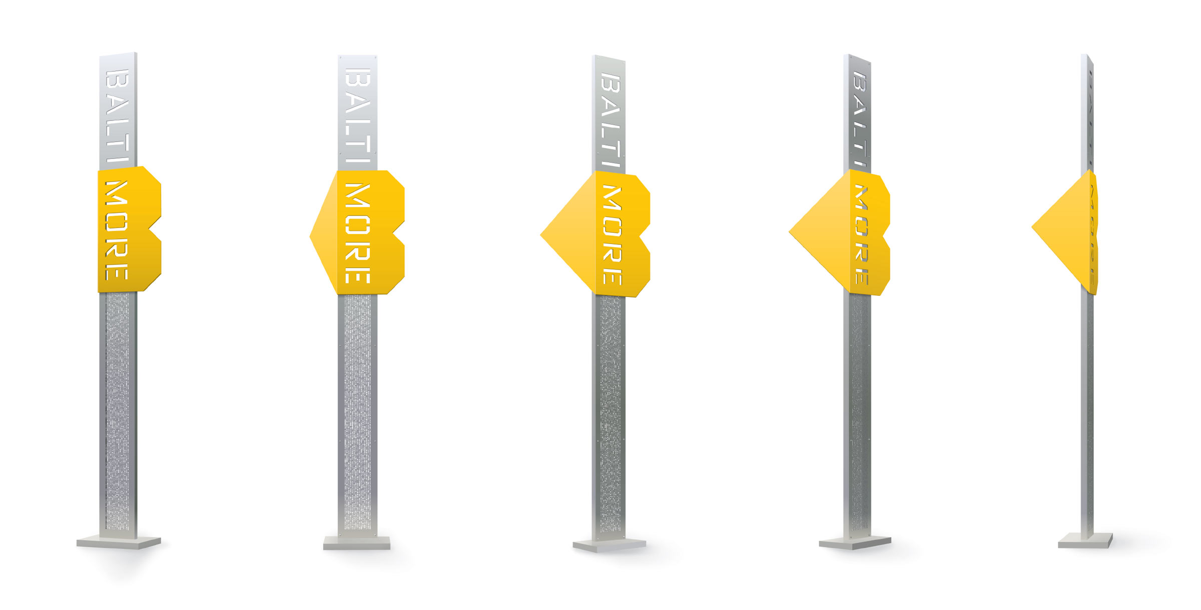
A sculptural family
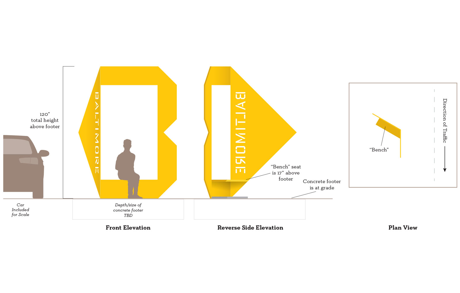
This design motif anchors a varied family of signs and sculptures intended for major roads into Baltimore. The variety of forms make each location feel special and encourage locals to discover all of the different designs around the city.
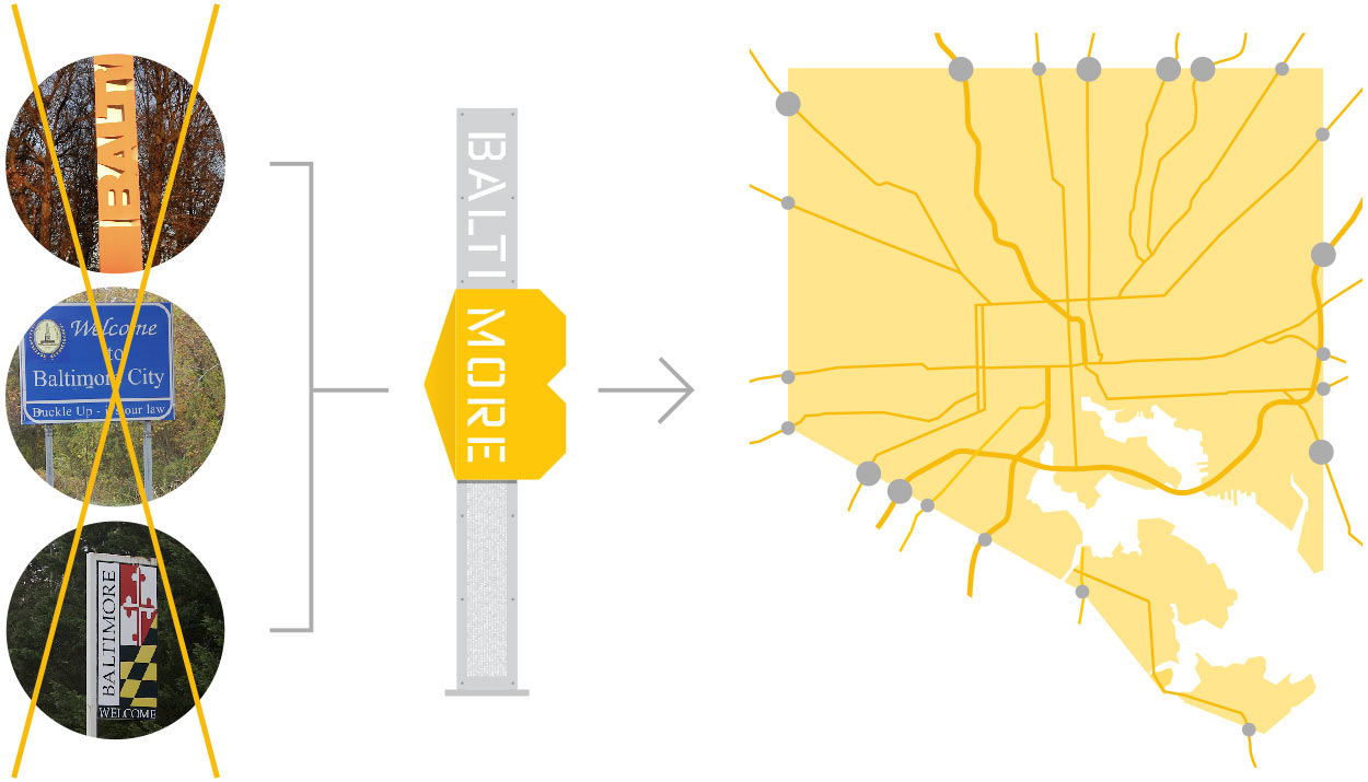
Proposed for major roadways crossing the city line, these designs would replace Baltimore’s old, rusty, and inconsistent signage.
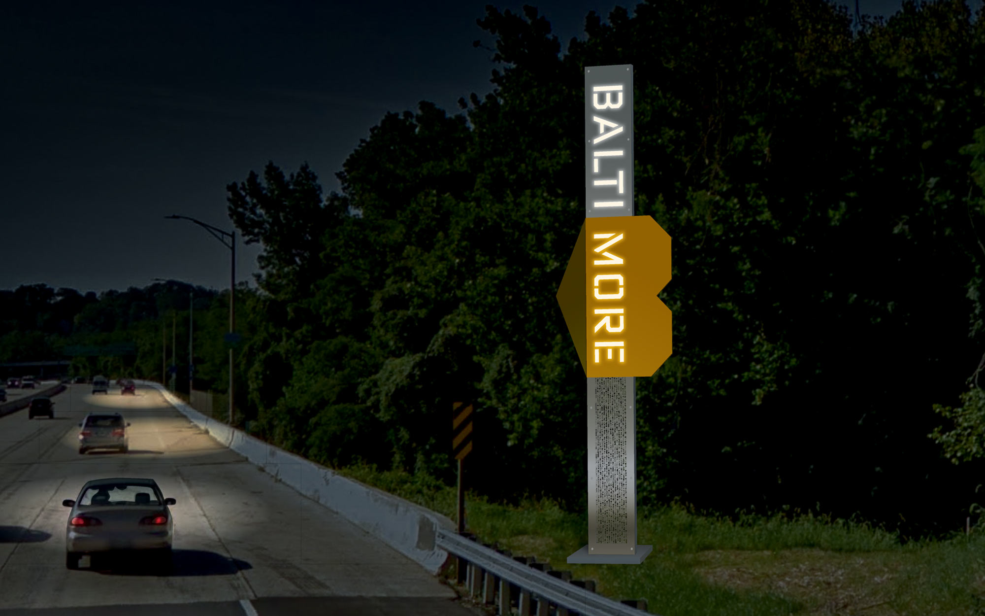
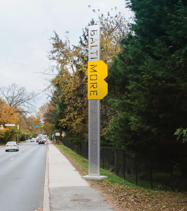
As drivers pass by one of these gateway markers, different symbols are highlighted. From a distance the “B” and “Baltimore” are clearly visible. As drivers pass into the city, the heart and arrow shapes become more prominent.
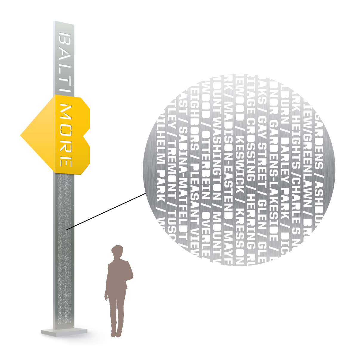
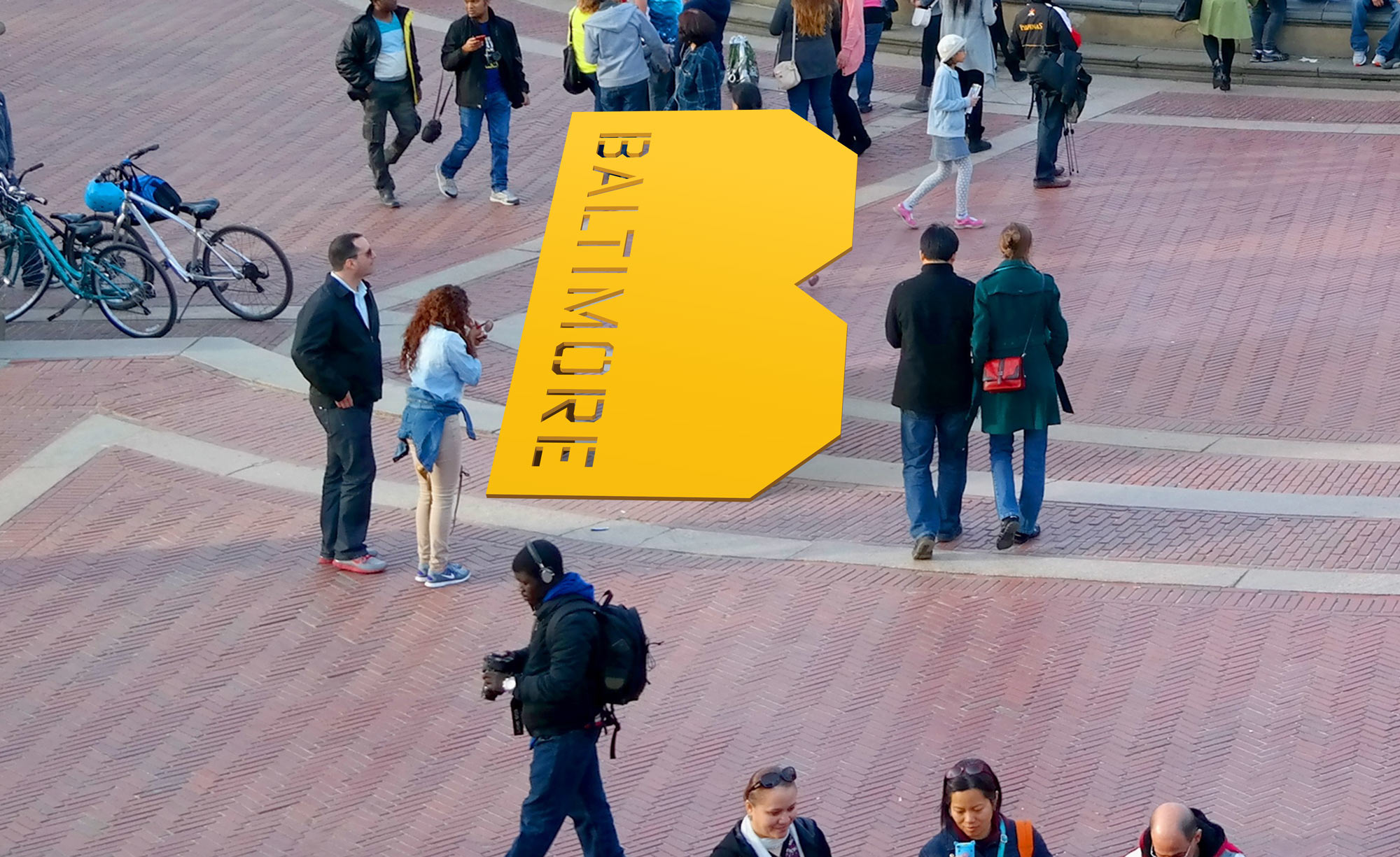
Find your neighborhood
Hundreds of distinct communities make up this “city of neighborhoods.” Each neighborhood gets a shout-out in these laser cut stainless steel panels. The typographic pattern adds an extra level of visual detailing for pedestrians as well as motorists.
Multiple scales and forms add variety to sites across the city.
More than just signs
We envisioned a comprehensive system that extends to placemaking applications, sculptural bus stop benches, bike racks, and even downtown wayfinding signage.
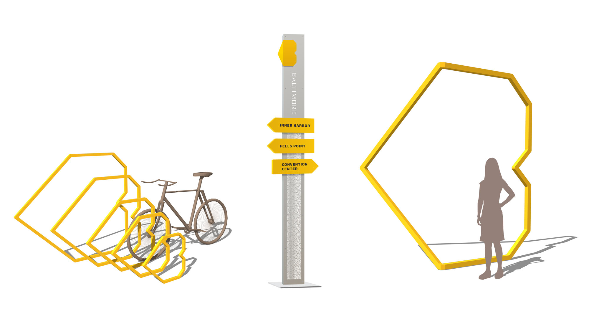
Freestanding sculptures encourage public engagement.
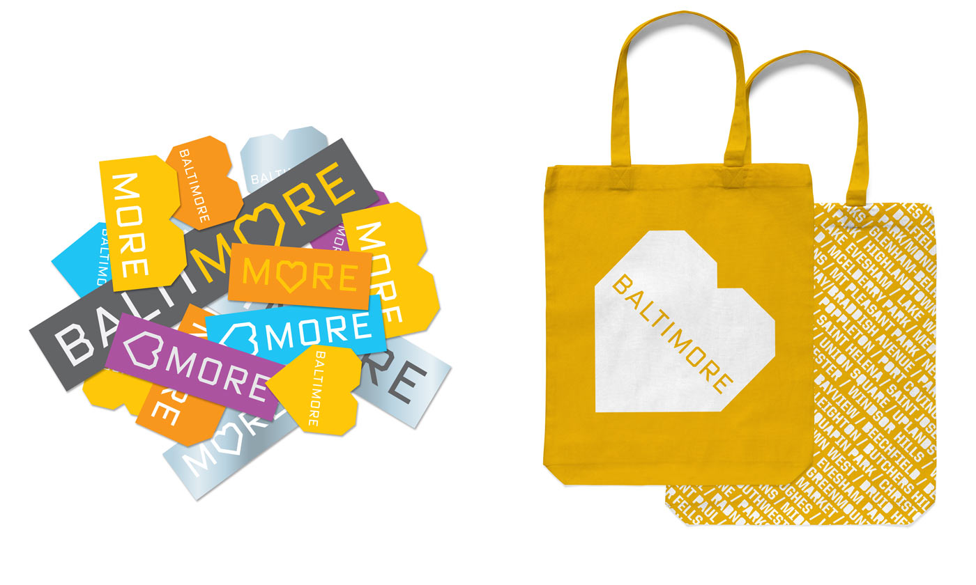
Other applications
To introduce the project, we proposed a family of promotional items to foster Baltimore pride and to generate funds for additional installations. The iconic design and flexibility suggest the beginning of a new brand for the City of Baltimore.