
A participatory logo and evolving identity for a leading art museum
Public Mechanics teamed up with Topos Graphics for this institutional rebranding of the BMA. The new identity repositions the museum as a national cultural leader and forges new connections with the museum’s local community.
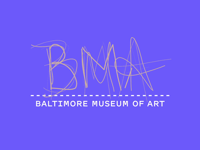
A collaborative logo
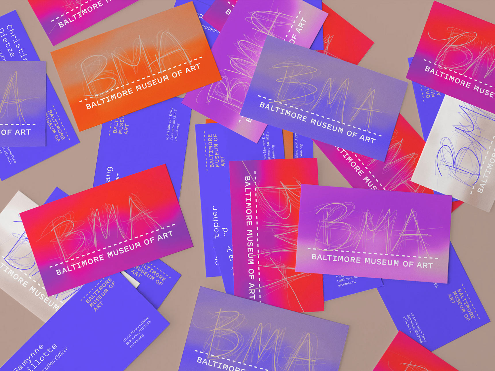
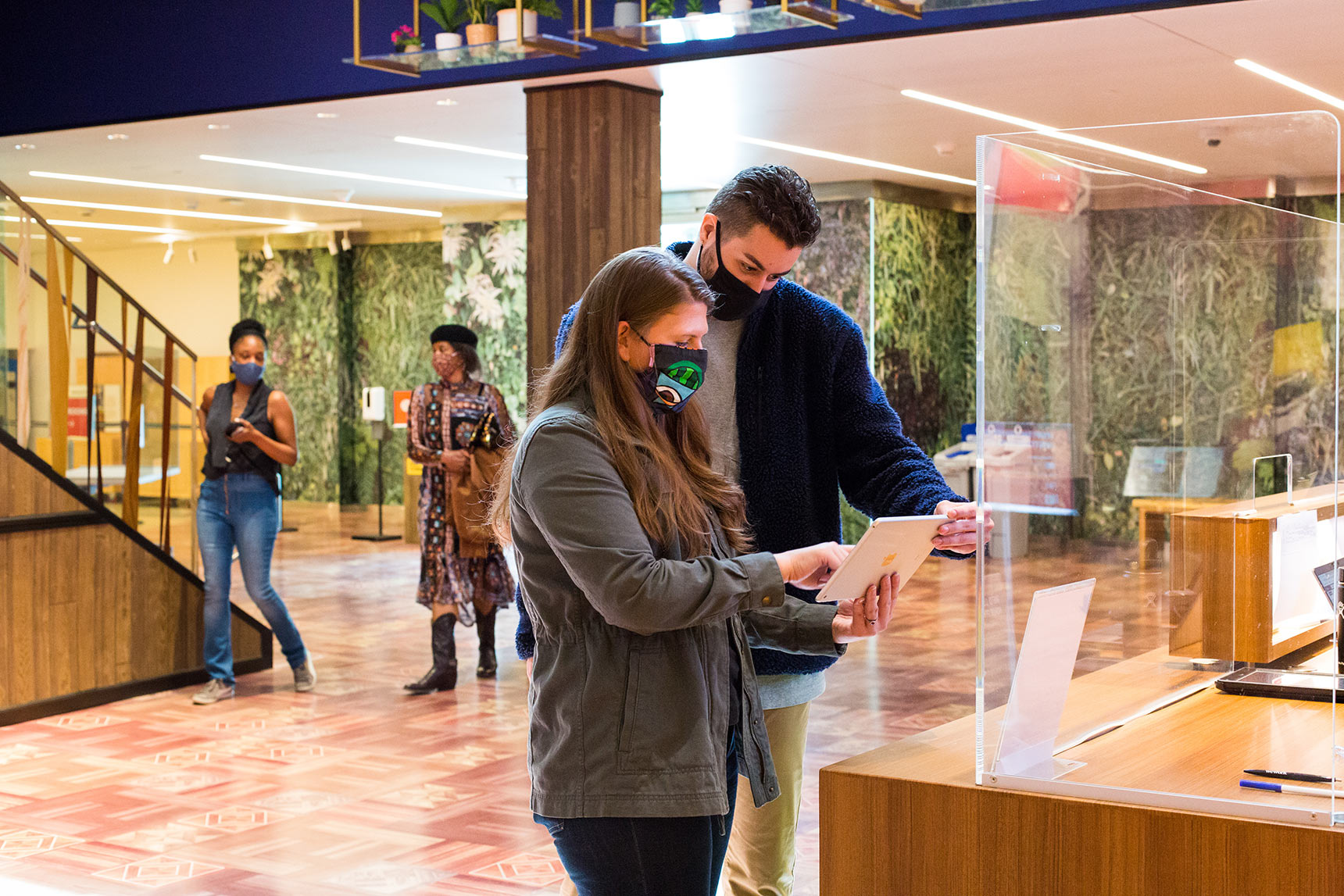
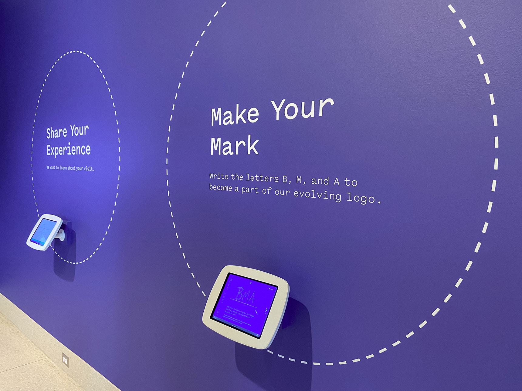
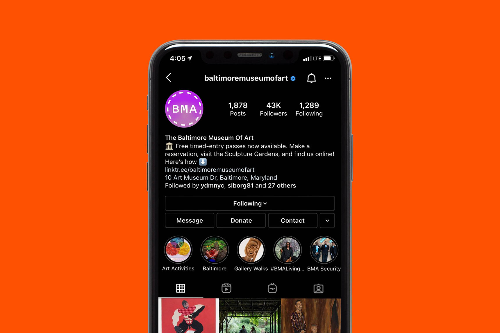
The evolving, experimental BMA mark incorporates the handwriting of thousands of Baltimore community members and artists. Visitors can contribute to this collective “signature” using an iPad app in the museum’s lobby. The visual identity includes a flexible color system, typography, and graphics that are designed adapt to the dynamic needs and audiences of a contemporary museum.
– – – – –
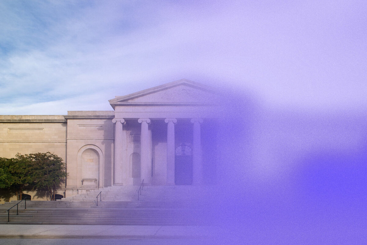
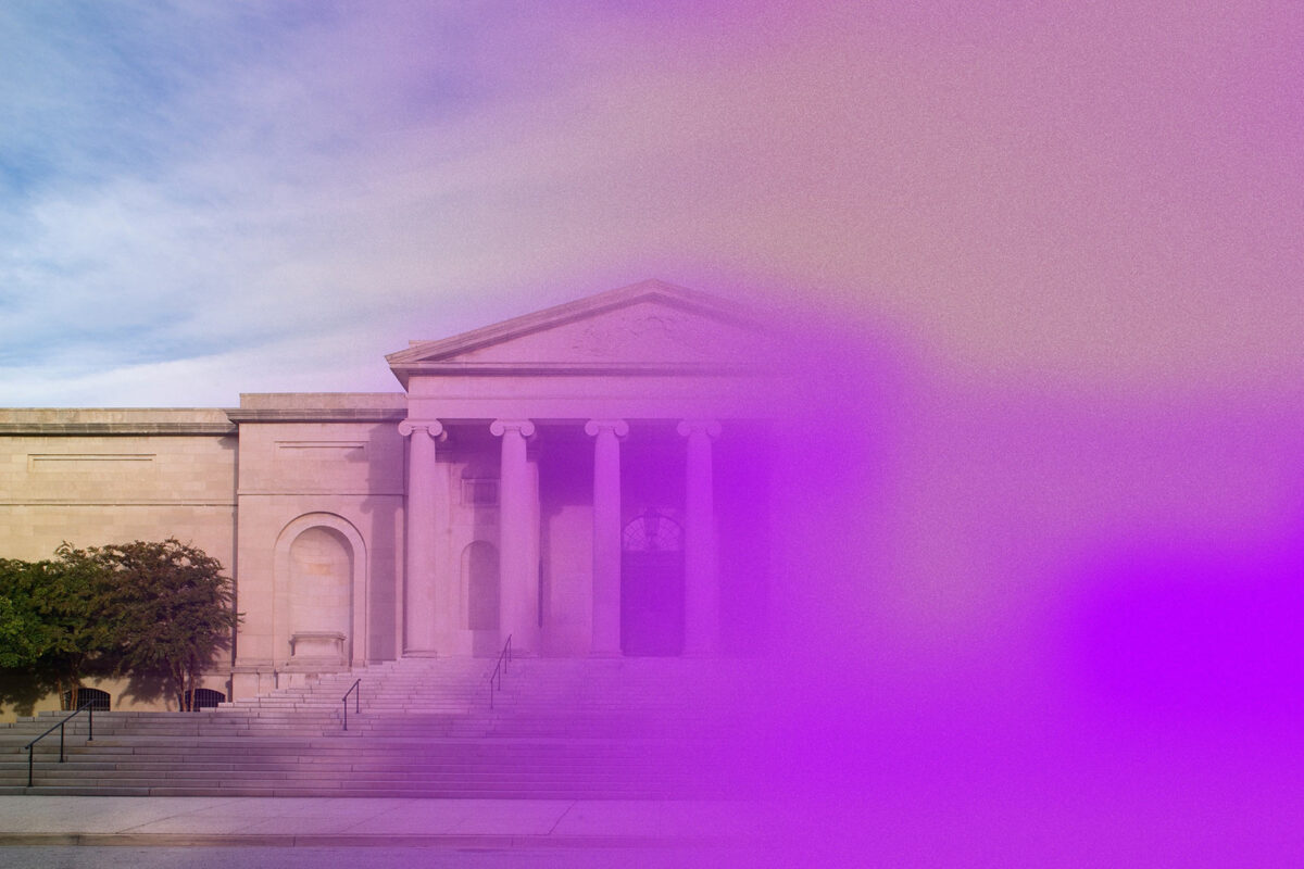
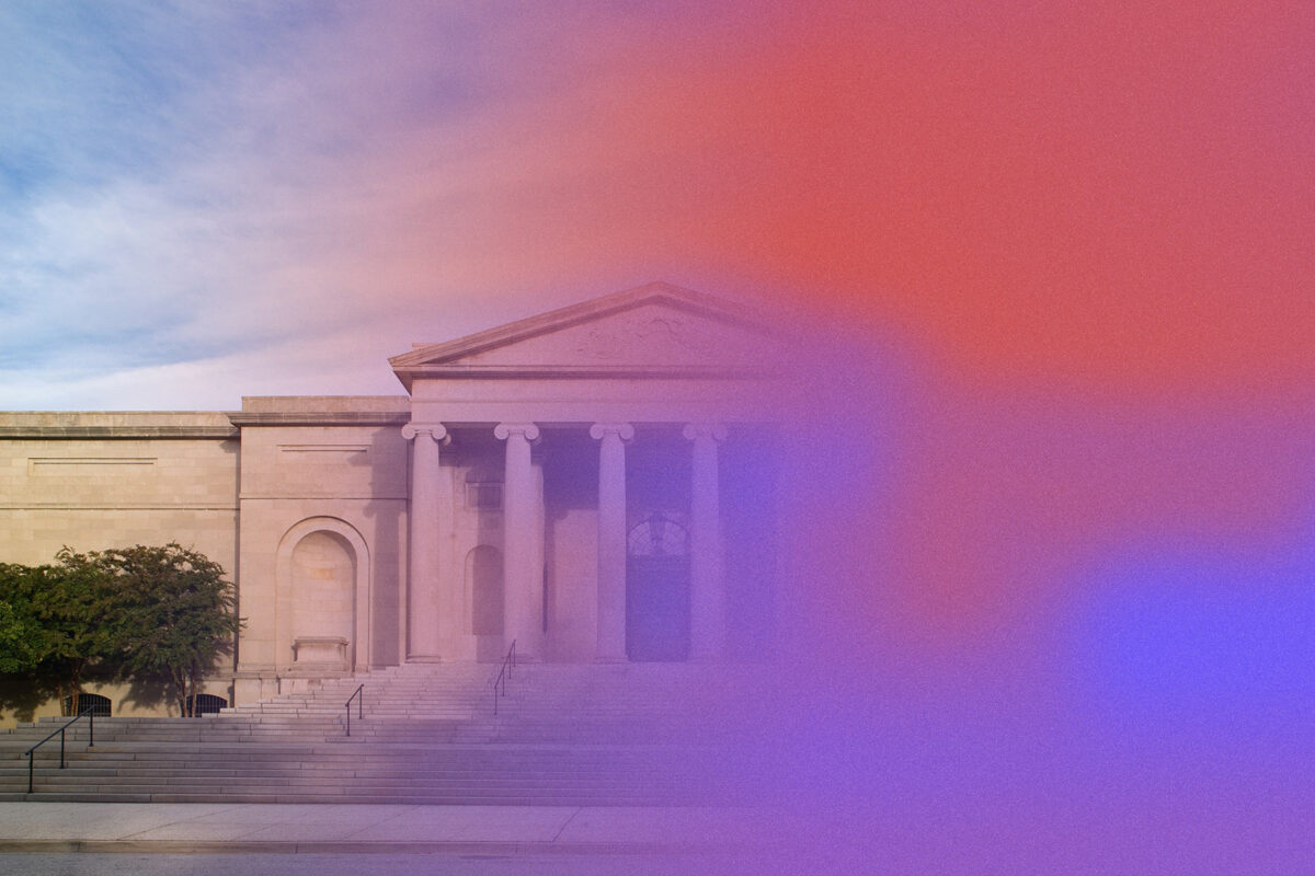
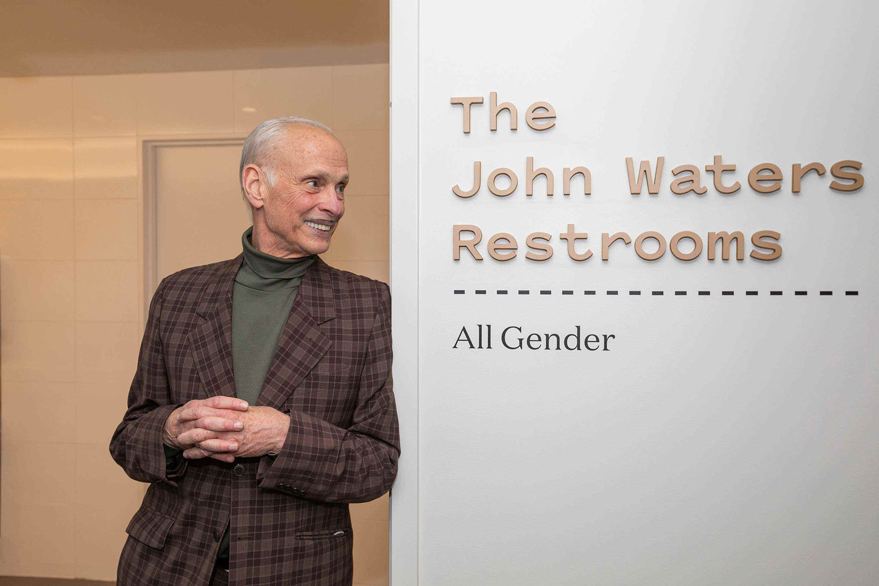
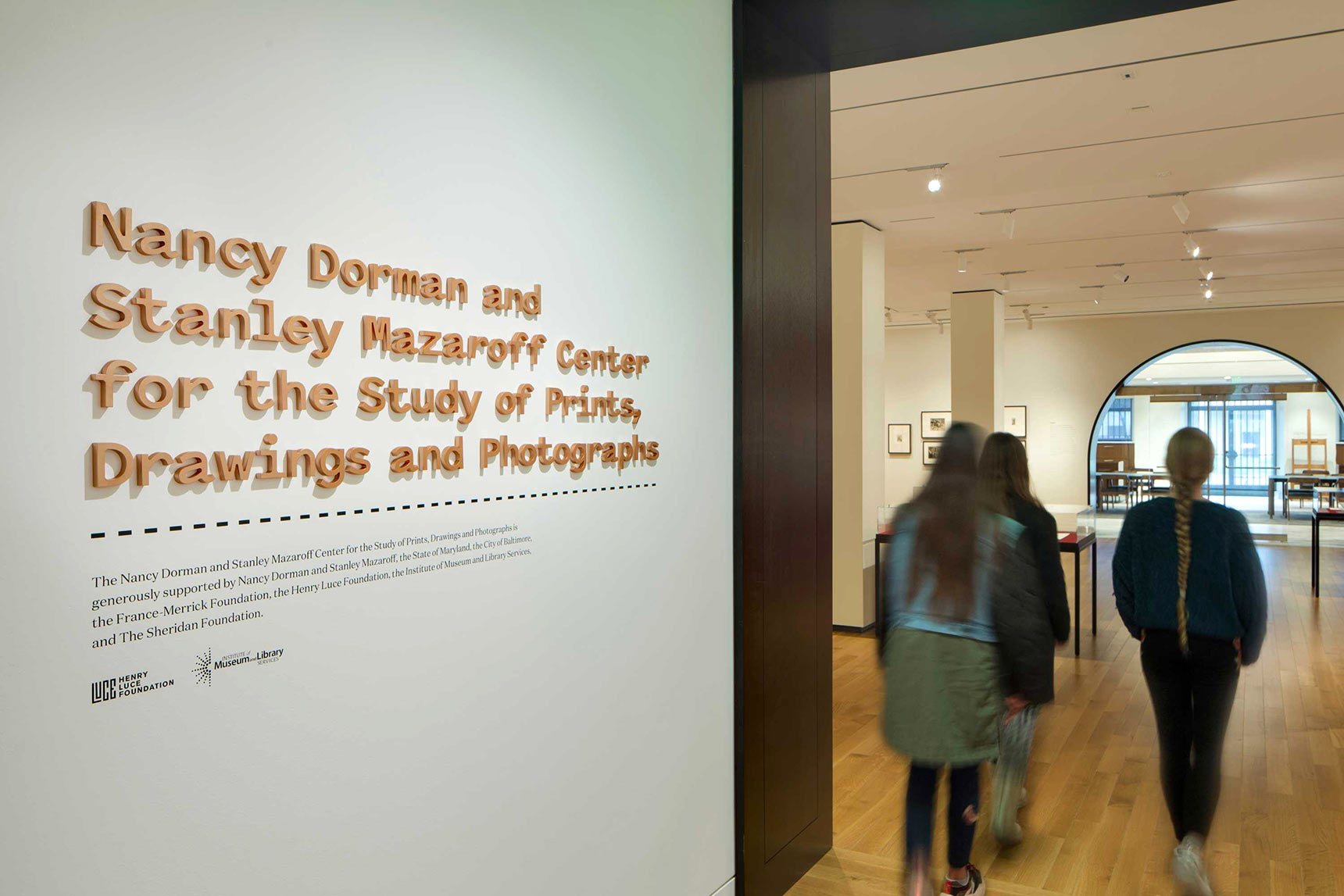
The dashed line plays an important visual and conceptual role in the BMA brand identity, representing the museum as an evolving platform for creativity and community. It is also symbolic of the evolving, dynamic nature of the museum — a work in progress, openness, a space for participation. The line provides the design team with a flexible graphic element for BMA sub-brands, branded iconography, print collateral, wayfinding, and more.
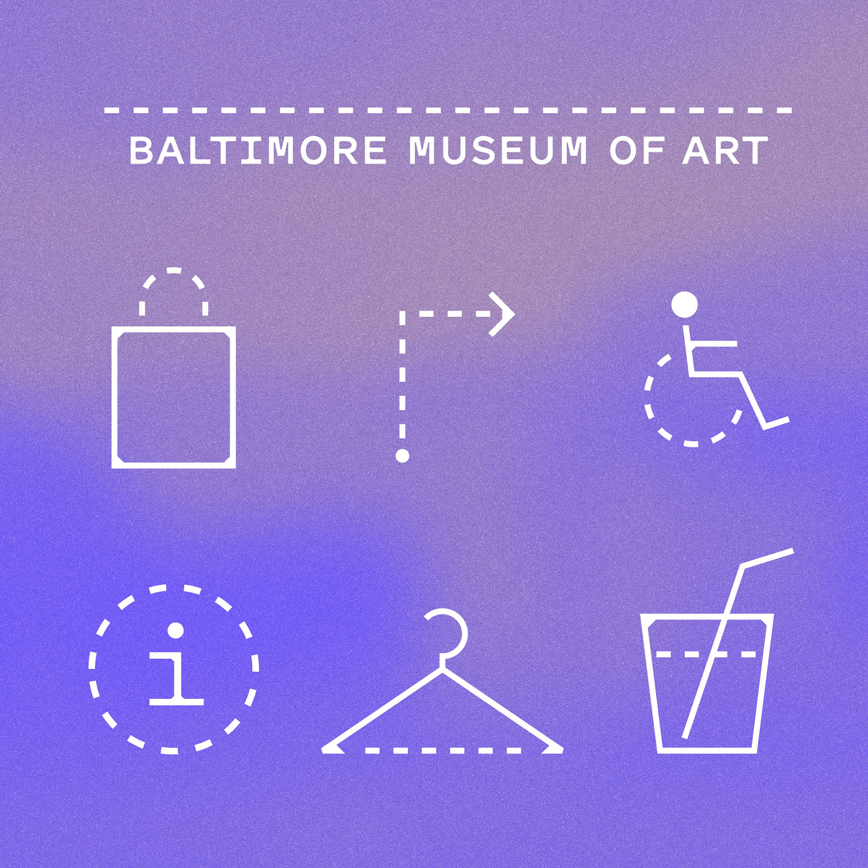
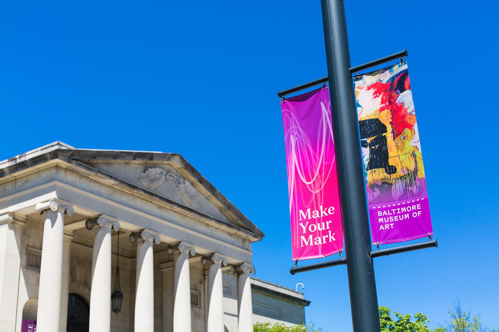
A flexible color system
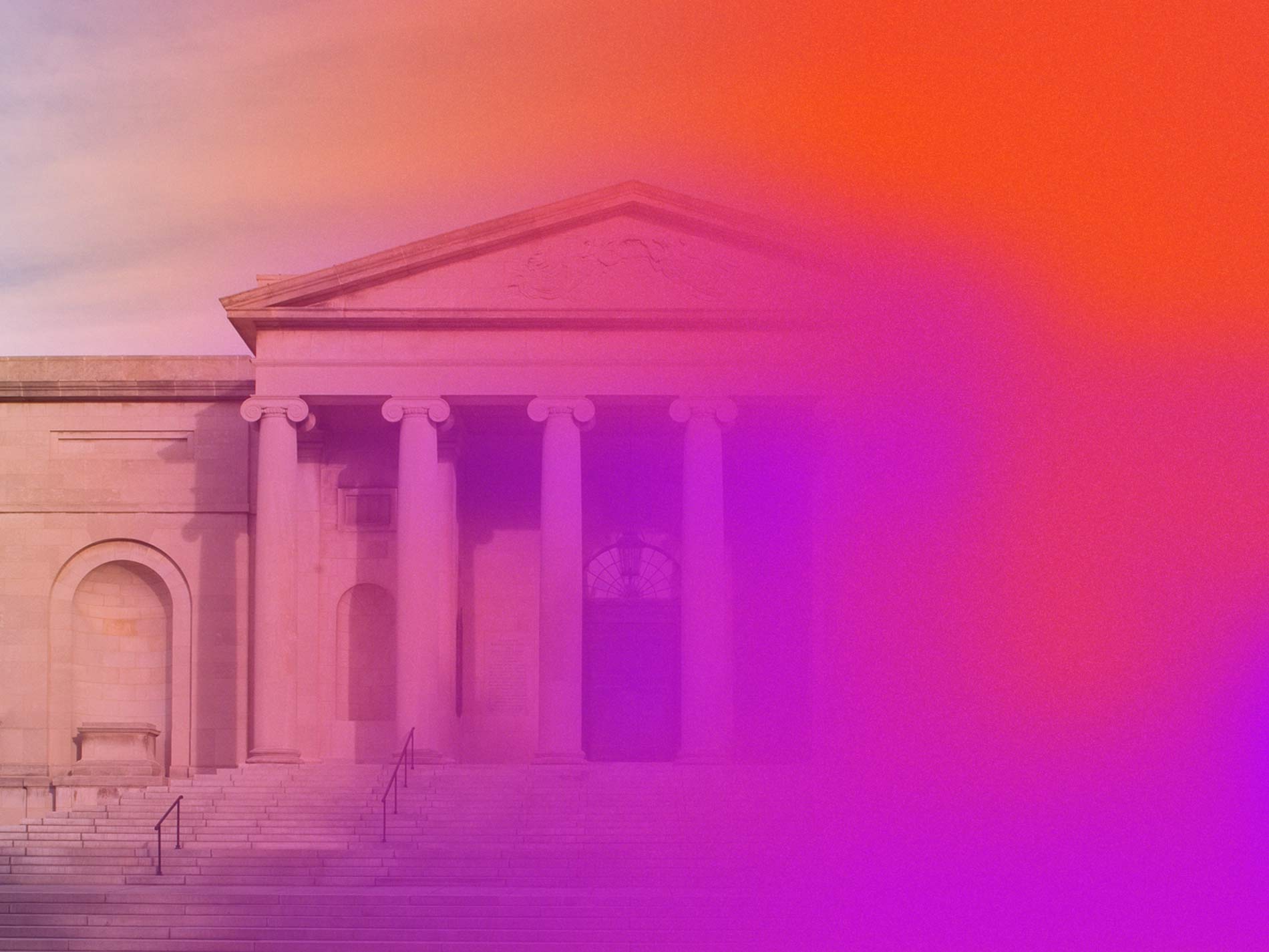
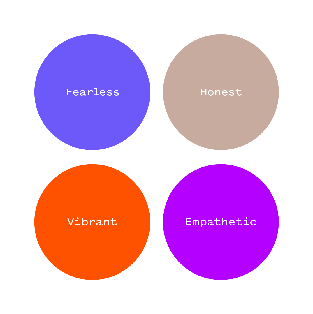
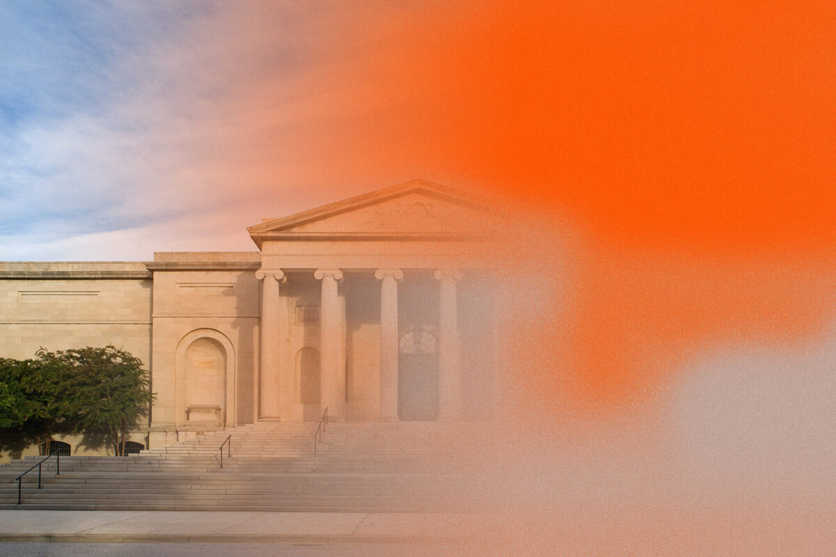
The Topos team conceived a comprehensive color system inspired by the BMA’s brand values: honesty, vibrancy, empathy, and fearlessness. The color also starts where the BMA began, with the gift of a painting called “Mischief” by William Sergeant Kendall. Calculating that painting’s average color value results in a tan hue, which becomes the starting point for the BMA’s institutional color system. (The color is also a nod to the museum’s sandstone facade.) Saturating this “honest” tone creates a vibrant orange-red hue. A warm purple, is color-analogous to the orange-red. Finally, for fearless, the team chose a color that defies easy description, a hue somewhere between purple and blue.
Because it’s a color system rather than just a palette, the relationships governing each color selection can be applied to create new palettes for special exhibitions, events, or other Museum initiatives.
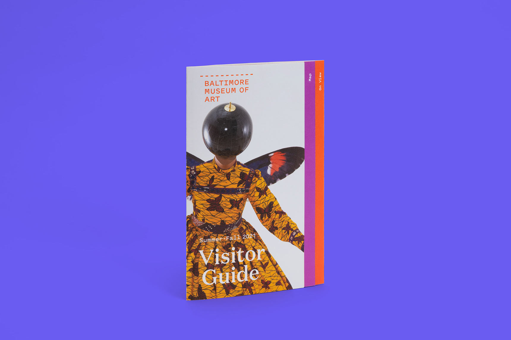
“We wanted not just to represent, but to create a means for a multiplicity of voices to come together. The logo celebrates the richness of the BMA community. The logo becomes more legible when the marks overlap and join together, and there is strength and beauty in the cacophony of hand marks.”
from the BMA announcement of their new identity